A week ago I wrote about the rendering below and how I’d hoped it would lead to a solution. A solution for the South side of a large terrace/patio.
So let’s do a little review
 Let’s start with a look at that rendering. This was the 4th or 5th drawing of what I was looking for along this edge of the patio. I needed the fountain centered on the wall and the ornamental wrought iron work flanking both sides. I was Positive about that.
How positive? The wall needs not only to screen the South side, block out the parking lot, and slow down the wind-it needs to add a sense of panache’, class, ornateness, timelessness, etc.
After discussing this rendering . . . with myself. I decided to move on and take it to the next level.
 This is the color rendering I decided to use for the presentation. It isn’t great, but it is good enough to use with a series of other drawings to tell the story of the patio.
Some quick foreground for a sense of scale, additional background to help frame the wall. For me the real key was to highlight the fountain/wrought iron areas. Emphasize the focal areas of the design.
The Reality of This:
Come up with a concept, believe in your concept(and design principles), draw this concept in loose conceptual form . . . and then sell your belief in the conceptual form . . . the concept for the site . . . not the drawing.
Sell the belief in the design and the concept-not the vehicle, i.e., a fancy drawing that sways the judgment of the client through their emotional response to the impact of the drawing.
Sell your skills, your use of solid design principles. Point out the relationship of your additions to the original site. Sell the solutions to the sites problems, or at very least the recognition of problems and possible solutions.
Through conceptual drawings and renderings this is possible, very possible.
Take a look at this drawing:
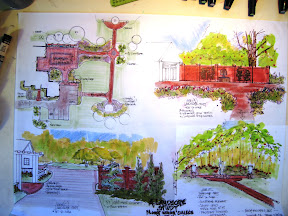
[ Telling a story about some space.]
When this is showed to a potential client I want them to be excited about the possibilities for their future. To realize that we can go beyond their initial thoughts, dreams, desires.
That I have looked at their entire landscape, all the area’s, and all those tough sites. Now is the time to get excited about the future.
______________________________________________________________________________________
Addendum:
This is a problem with guys using fancy CAD drawings/renderings.
They go right to the final solution/the final drawing. Usually there is no in-between, no concepts, no options. Just hard and fast lines.
They believe in the final CAD drawing and that visual impact of that type of rendering. They put learning that skill in front of learning what actual design principles are. That is the problem with designing with software, on a computer in the office.
More on this as time goes by.


This is the place to comment.